BRAND REFRESH


Hellards Estate Agent. Brand refresh
Long established and highly regarded Alresford Estate agent Hellards, asked us to help refresh and define their brand.
While not looking to change or lose their core identity, Hellards felt the brand was looking tired with the dominant darker brand palette usage, no longer reflective of the business. The strap line ‘All About Alresford’ did not represent the wider appeal and reputation Hellards now enjoy.
We very clearly understood that we needed to make the brand more relevant but not to compromise the established recognition and association. Subtlety was key.
Firstly we addressed the logo, revising 24 points within the crest to balance proportions and improve the graphic execution.
We lightened the grey within the shield and replaced the dark Keyline with the maroon of the logo font – -thus simplifying and uniting the colour palette.
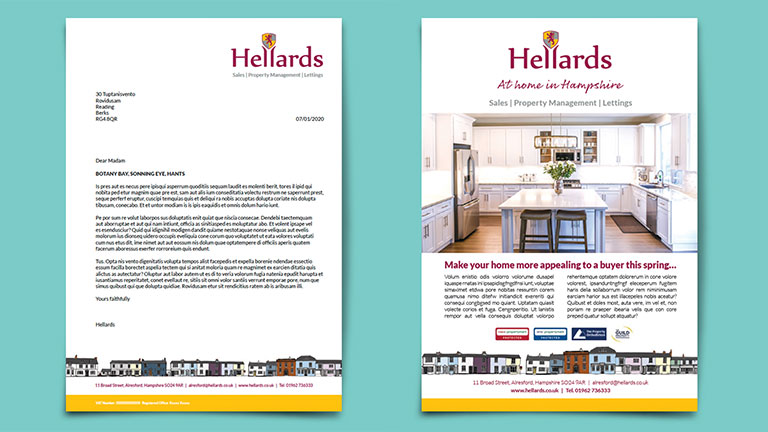
We then looked at applications across Hellards collateral, changing the use of heavy block colours into accents and highlights, which immediately introduced a more modern and energetic feel. We addressed the conflicting typography and introduced a contrasting script for the new positioning of; ‘At Home In Hampshire’. We then applied the refreshed brand across all on and off line platforms, from signage to the new Hellards website. Creating digital banners and print ads, stationery, advertisements and a simple brand guidelines for all staff to use and adhere to.
Date
June 2020
Client
Hellards Estate Agent
Category
Brand Development
